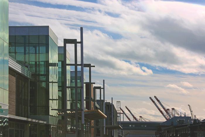
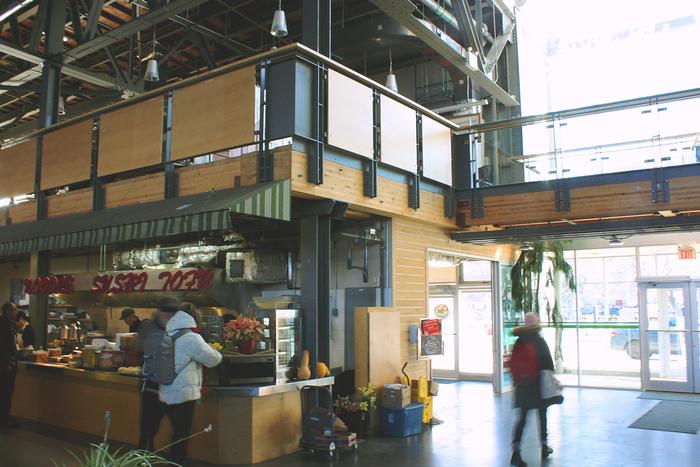
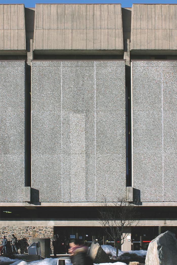
Michael Philpott - EssayHealthful Halifax: Designing Healthy Spaces, Learning by ExampleIn September 2012 I moved to Halifax, Nova Scotia, Canada, to begin my architectural education. I spent my first weeks in the city searching out its public spaces: spaces to relax in, to work in, to meet friends and think in. I returned to some and made a point to avoid others, but only after immersing myself in the study of architecture did I realize my own experiences might answer the question: “how do you design a healthful environment?” In order to tease out the elements of healthful design - those that make a space comfortable and a person more likely to return - I will look at two local buildings in stark contrast: the Halifax Seaport Farmers’ Market and Dalhousie University’s Killam Memorial Library. Through a comparative study of these institutions, each among the most used public buildings in Halifax, I will begin to uncover the effect of architecture on the health of public places. I hope this study will be valuable for my own future practice in architecture, as well as for the growing body of knowledge that informs healthful design. Healthful architecture is no new concept. Early architect Vitruvius described, in the 1st century BC, the need for an architect to “have a knowledge of the study of medicine on account of the questions of climates, air, the healthiness and unhealthiness of sites, and the use of different waters,” believing that “without these considerations, the healthiness of a dwelling [could not] be assured” (10). Nearly 2,000 years later, the germ theory of disease suggested that architecture could actively fight the spread of infection. Medical practitioners of the 19th century began treating the house as if it were an extension of the patient. Architects designed homes that isolated inhabitants from their urban neighbours, while medical professionals such as Drs. Drysdale, Hayward, and Boswell Reid designed and tested ventilation systems that removed “foul air” from habitable space. Today the topic is alive as ever. In 2013, MIT’s Center for Advanced Urbanism, in collaboration with the American Institute of Architects, released their “Report on Health + Urbanism” which, rather than making conclusions, states that “the relationship between the physical design of cities and the health of the people who live, work, and play there must be better understood” (Berger 5). Despite its long history, the proper design of healthful environments is far from settled. The present essay will provide just one comparative study in the search for an architecture that cares as well as shelters. On Saturday morning you bike to the waterfront. The air is crisp and the boardwalk is buzzing; women, men, children, and families walk, run, and ride with you. There are songs in the air, pastries in hands, and smiles on faces. At the path's end you reach the Halifax Seaport Farmers’ Market. Its warehouse shape is part of the industrial waterfront stretching away behind it, but its walls are clad in wood like traditional clapboard, and tall glass prisms punctuate its long flank (Figure 1). Inside, the sounds of live music and innumerable conversations wash over you. Vendors of all shapes and sizes populate the space as you breathe deep and browse their sunlit displays. Whether arriving by land or by sea, the Seaport Market cultivates a healthful environment for all its users. The healthful environment of the Seaport Market, like the personal health of those who visit it, is the product of many interrelated systems. Its environmental system, for example, is even made up of myriad sub-systems. Plumbing fixtures in the building use little water and are supplemented by rainwater collected from the market’s roof. Sunlight is used both for illumination, to reduce the market’s reliance on electric lights, and for rooftop water heating. Deep geothermal wells store heat for the winter months, and a planted green roof, which cools the building in hot periods and provides a rare urban habitat for local insect species, is one of the largest in North America. Even during construction, a phase notorious for its negative environmental impact, the market’s architects strove to use local building supplies, to reuse existing structure and materials, and to recycle 95% of construction waste. These design choices benefit the environment and the market’s users by keeping land, sea, and air clean for habitation and use, and by slowing the effects of climate change on agricultural livelihoods. A second system is physiological. The Seaport Market’s location, at the terminus of a developed boardwalk along Halifax’s waterfront, encourages physical activity; it serves as a goal and destination for those enjoying the outdoors, and as a point of departure for market-goers and tourists. Its market culture, built by an active agricultural and craft community, ensures that healthy, local, and organic food is always available. Glass towers, mentioned above, provide natural light and energy to those inside, while operable windows and a passive ventilation system ensure fresh air is cycled through the space without the use of power. A final system is one not designed by an architect but facilitated by his or her efforts. The market’s social environment is key to its healthfulness and success. It is valuable as a public place where one may work, relax, or attend community events free of hassle or cost. Its modern facilities for emerging artisans and entrepreneurs encourage local business and increase the self-sufficiency of the entire province. The market’s multicultural tenants encourage an accepting and vibrant community by proudly sharing their traditions and foods. In addition, the market’s face-to-face and open style encourages customers to form relationships with their vendors often missing from contemporary grocery shopping. The building was conceived of, according to its lead architect, as a piece of infrastructure facilitating the activities that go on inside it. Its design fades into the background, making the market experience easy, enjoyable, and healthy without its users even noticing (Figure 2). Elsewhere in Halifax a very different procession is taking place as hundreds of students flock to Dalhousie University's Killam Memorial Library. “The Killam,” as it is commonly known, is a monolith of sheer stone walls sparsely pierced by deep-set bands of windows (Figure 3). Users enter the library at its base, through a central atrium of tinted glass, and navigate by elevator to choose from study spaces surrounding the atrium on five levels. This centrepiece forces the library’s functional areas to the perimeter, making its halls narrow, its stacks crowded, and its layout disorienting. Its brown light is more suitable for preserving rare manuscripts than for supporting human life. For the hundreds of students, staff, and community members who visit it daily, the Killam represents a barrier to health. The Killam, like the Seaport Market, is a space of many systems. Environmentally, in contrast, it leaves much to be desired. Completed before production of the low-flow toilet or widespread use of solar power, the Killam’s systems are not particularly energy-efficient. Its atrium is lit naturally, but the light’s quality means that even on the brightest days every light in the surrounding building remains on. While local stone was crushed during construction and used to adorn the library’s outer walls, the overwhelming majority of its structure is concrete, a material better known for its low cost than its environmental sustainability. In comparison to the Seaport Market’s local wood detailing, the Killam is decorated in a far-from-local Brazilian rosewood. Physiologically, the Killam fares little better. Stairs beyond the first floor are hard to find, while elevators, which staff report are the busiest in the region, figure prominently in the lobby. Users have little access to daylight, especially on lower floors, and the building’s mass is so deep that fresh air can only be circulated mechanically. Access to healthy food choices at the Killam is likewise lacking; its two vendors are international chains with few local or organic products to speak of. The Killam’s social system is perhaps its strongest. As one of the largest public spaces on campus, the library’s atrium is always well-used, and its food services are popular between classes. The library provides valuable study space and its auditorium and public rooms are frequently booked for student events. The situation, however, is not ideal. Studying with a view, across the atrium, of similarly stressed students only compounds the stress of looming deadlines, and artificially lit rooms create feelings of claustrophobia and tension. There is also the feeling among some of its users that the library is an oppressive building. The Killam is built in the “brutalist” style (for the French béton brut or “raw concrete”) characterized by heavy, block-like shapes and imposing facades. The style was once popular among educational institutions for its impression of permanence, but its raw, utilitarian appearance led to student rumours in Halifax and abroad that the buildings were meant to exert a kind of totalitarian control over their users. These are the conditions and design choices, uncovered through personal observation and informal interviews, impacting the health of my case studies. The importance of environmental systems, both in terms of long-term cost-savings and the already-visible effects of climate change worldwide, is a given. Access to fresh air and daylight also appear to be universally important for architectural and individual health, while social opportunities, supplemented by their environment, represent another key, if less predictable, factor. The remaining question then becomes: how do these considerations become buildings? The pre-conditions for the Seaport Market’s healthful design were a passionate client, an experienced and likewise passionate architect, and open-minded bureaucrats at all levels. The client was a co-operative formed by existing market vendors and interested community members who were adamant that their future home reflect their shared values. The lead architect, a long-time student of and advocate for sustainable design, embraced this vision. Together they believed the market could act as a model for the community. Financial support from the municipal government, as well as co-operation from the federal government, on whose land the market is built, were also important factors in ensuring its success. As a building built by the cooperation of a community, it is no wonder that it serves its community well. The Killam Library represents this process in inverse. The architect worked with the client, however the client did not represent a united community of users. Administrators spearheaded the process while disagreeing over design choices such as the variety of stone to use for the library’s exterior. I further believe the expressive, sculptural style of the library indicates that the architect was partly designing for an audience of architects who would appreciate his stylistic choices. The worst design choices, however, came after construction. Insensitive renovations in the 40 years since the Killam opened have marred its architects’ intentions. The atrium was an open courtyard until 1996 when a roof was added, increasing floorspace but removing a source of natural light and fresh air. The glass ceiling now excludes much of the light that hits it, and the atrium’s tinted windows further dim what enters (Figure 4). The subsequent addition of food services to the atrium resulted in a distracting mix of sounds and smells throughout. In an attempt to future-proof the state-of-the-art library, the Killam’s architects allocated a great deal of extra space for the expansion of collections and services. However, the university quickly filled this buffer with more and more material and functionality, such that the library built for 8,000 students now serves a student population of 18,000. Today the library is undergoing further change, including the proposed addition of a glass atrium which the university’s master plan describes in terms of its “transparent exposure, solar collection potential and controlled natural day light penetration” (IBI Group 21). The plan acknowledges the library’s current shortcomings and suggests a much-needed remedy. Located centrally on Dalhousie University's main campus, between the downtown's North and South ends, the Killam Library has the opportunity to be a crossroad, a meeting place, and a welcoming space for students and the community. After studying both buildings I believe I am better able to see a possible path to this vision. The library, for instance, would gain much-needed floorspace by building into its under-used forecourt. This would align the library with the rest of the campus (much of which did not exist at its construction), while creating multiple smaller, more useable outdoor spaces. The addition could house new study areas and technological infrastructure, and create a more dedicated space for food services. With the atrium no longer necessary, I would once again uncover the courtyard to let much-needed light into the original building. This would create multiple study and social zones with varying degrees of daylight, privacy, and noise. Achieving this vision would require cooperation from administration, the student body, and related government agencies. In an ideal world the library would further incorporate environmental systems such as green roofing and passive ventilation. The Seaport Market’s potential for health is still beyond most existing or proposed developments in Halifax, but there is always room for improvement. The green roof is currently a little-known resource, and many of the environmental systems, such as geothermal heating, go unappreciated. By flaunting its features the Seaport Market could serve as an example for builders, architects, and the public at large. On a larger scale I believe municipal and federal government support could further improve the success and long-term sustainability of the market. Mixed-use residential development on nearby land currently used for parking could enliven the neighbourhood and bring more year-round foot traffic to the area. As the above case studies demonstrate, healthful design is multidimensional but by no means unattainable. I discovered, through a comparison of the Halifax Seaport Farmers’ Market and Dalhousie University’s Killam Memorial Library, that the keys to environmental health include: cooperation between architects, clients, and user-groups; a holistic approach to design that considers environmental, physiological, and social environments; and the thoughtful renovation of previously designed buildings. While a wider study would likely uncover far more nuance in the design of healthful environments, the present comparison is, for me, a starting point. I have become more aware of the considerations behind healthful design, and more perceptive of architectural responses to these considerations in my city. I have come to realize the influence that architecture - and architects - have on the health of built environments, and my own responsibility to design towards a more healthful city. Works Cited Berger, Alan M., ed. Health + Urbanism Report. Cambridge, MA: MIT Center for Advanced Urbanism, 2013. Web. 1 Feb. 2014. IBI Group. Dalhousie University Framework Plan. 2010. Web. 1 Feb. 2014. Pollio, Marcus Vitruvius. The Ten Books on Architecture. Trans. Morris Hicky Morgan. Cambridge, MA: Harvard University Press, 1914. Project Gutenberg. Web. 1 Feb. 2014. Additional Help and InformationAre you in need of assistance? Please email info@berkeleyprize.org. |


