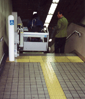
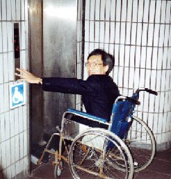
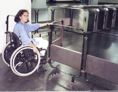
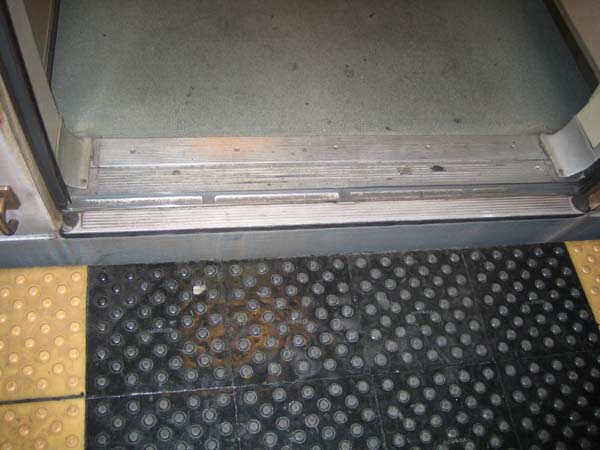
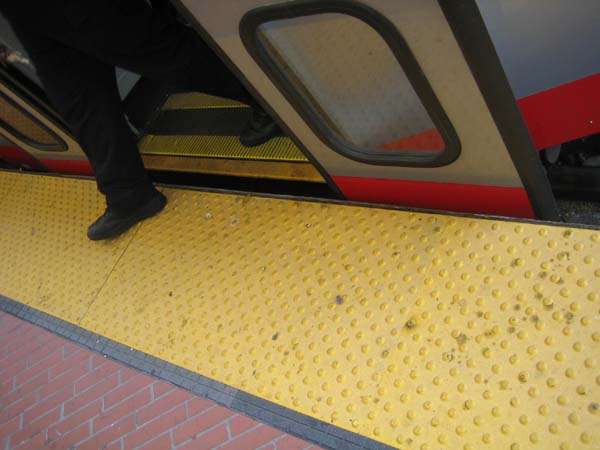
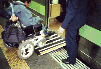
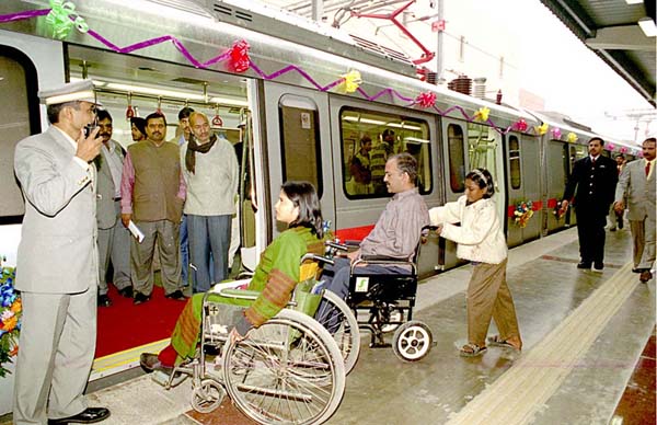
Josh SafdieFIRST SEMESTER REPORTJosh Safdie, Associate AIA Urban Visionaries – Expanded Additional ThoughtsMy students were asked this semester to stand in the shoes of the urban visionaries of the past and to consider the future of cities from a “whole cloth” perspective. The focus of their thinking was intended to get them to imagine cities as more environmentally sustainable, and more inclusive. When I say that their perspective was a “whole cloth” perspective, I mean the following: The typical approach to urban planning studios is to identify the problems of our cities, and then to imagine narrow strategies which incrementally improve them. This has a great grounding in reality, but it does not encourage creative thinking, particularly for students. Instead, I asked my students to think as broadly and fantastically as possible. It took a little while, but once they warmed to the idea the students invented entirely new cities and, in some cases, even planets. I found that thinking about environmental sustainability was quite easy for the students, as it is very much in the zeitgeist of architectural education in the States today. They see it on-line, in magazines, and in almost every one of their classes. Thinking about human diversity, on the other hand, was more challenging for them – and so as the semester progressed I found myself devoting more and more effort to supporting this particular set of ideas. A turning point in this effort was our “City Walk”, where on a sunny Saturday morning we took a walk through downtown Boston with our user/expert colleagues. The students got to witness first-hand the challenges of negotiating the oldest subway system in the country while using a power chair, carrying on a conversation while walking on a busy street with someone who is blind in one eye from a stroke, etc. It was during this experience, which happened in October, when I really began to notice a significant shift in the students’ approach to the studio and to their work. Our “City Walk” included two user/experts. “Brian” is a man in his late forties who uses a power chair to navigate the city. Brian has only one leg and neither of his upper limbs is fully formed – so his physical presentation was definitely noted by the students the first time he joined us for class. “Tina,” on the other hand, has less visible limitations – she suffered a stroke some years ago and now has minor hemiplegia, which includes limited vision in one eye. Both Brian and Tina are people who have turned their experience of disability into a professional expertise (as authors, lecturers, consultants, etc.) and so they were quite adept at fielding the students’ questions, putting them at ease about the ‘difficulties’ they faced during the City Walk, and more. Because of their varied abilities, Brian and Tina also were able to help the students better understand the wide variety of human ability that Universal Design aspires to serve. As the “City Walk” continued, the students were able to warm up to talking with the user/experts about their experiences. The fact that it was a warm and sunny fall day in New England certainly helped, but I think the experience of being ‘at loose ends’ in the city for a few hours was really freeing for everyone. The act of walking also allowed smaller groups of individuals to cluster together for more private conversations, and the physical presence of the City (and all of its barriers!) also gave the students and the user/experts plenty of opportunities to discuss these things in real time. Brian did a great job of walking the students explicitly through every step he has to take in order to ride the [mostly] accessible subway, and explained to them the social aspects of his experience as well as the specific mobility-related aspects: i.e., “I have to flag the train down and make everyone wait while the conductor gets out of the booth, pulls out the ramp, and allows me to board.” At the end of the “City Walk,” we took the time to stop for a coffee and talk about our shared experience. During this talk and afterward, the students told me (and our user/experts) how valuable – and how eye-opening – the experience had been. One student said over coffee, “I will never, ever look at the City the same way again.” Another said, “I think an experience like this should be required for every student in our program.” From that point onward, the conversations about inclusive design were easier. Disability was still a primary topic because it was still a body of ideas that was foreign to them, but the students easily and readily expanded the conversation to issues of social and economic justice, democracy, race, class, and race. They became aware of subtly-ingrained biases, such as one student who made an earlier vignette about a green industry in their imagined city and the day of the crit suddenly noticed that she had collaged in people of color doing the manual labor and white men wearing the lab coats and holding the clipboards. These kinds of self-realizations happened repeatedly throughout the semester, and it became quite common for students to comfortably “check” each other on these issues. Brian and Tina came to several ‘pin-ups’ of student work over the remainder of the semester, and they were able to engage the students on this level as well. Despite this shift mid-way through the semester, I still think that the final “Utopian” projects that the students produced favored environmental sustainability much more than inclusive design. I said as much during the final review of this portion of the work, and one of my colleagues from MassArt disagreed. He actually said that he felt that issues of inclusivity permeated throughout the work – so much so that it wasn’t even necessarily obvious. He said that he felt the students had embraced this attitude to such a degree that they didn’t feel the need to ‘make a point of it’ because they didn’t even see it as ‘unusual’ or ‘new.’ I’m not sure that I agree with this one colleague’s evaluation of the students’ work, but it did cause me to think differently about what I was doing. For me, my colleague’s comment really raised the question: should the studio make disability a primary and obvious focus since it is so rarely addressed in their other courses, or is it really better for a broader, less specific attitude about inclusive design to be developed more subtly in the work. I see the former approach as a chance to truly make a statement about these issues, but I see the latter as a way of “normalizing” an issue that has most often existed only outside the margins of architectural education. Ultimately, I do think that an earlier, more overt conversation about disability and diversity may have benefitted the students even more. I really didn’t want the class to be “the disability studio” because within our work at IHCD we are constantly trying to expand the conversation to be more broadly applicable. But for the students, I actually think a narrow focus on design for disability – at least at the outset – would have given them a more solid base from which they could then expand in their own directions. Despite my colleague’s comment at our review, I don’t think that the tacit, “this is a world for everyone” approach is enough for me. It’s too non-specific, and it’s too ‘slippery’ – it allows the students to simply make claims about inclusivity and diversity, and doesn’t require them to play out the specifics of how it works. I also feel that the final work does not stand strong enough as an example of a different way of thinking about design. As free-thinking and creative as some of it may have been, if falls short of making the fundamental argument which I wanted it to make. As I am now writing this several weeks into the second semester, I can say that this semester’s course has begun with a very explicit focus on design for disability and I am enthusiastic about the early returns. As the “warm-up” project for a multi-family housing studio, I had the students spend the first weekend of the semester measuring and drawing their own apartments. We then, on the second day of class, visited the home of a young woman who is a wheelchair user, which our studio had renovated several years back. In “Sally,” a young woman in her mid-twenties who had graduated from a University right down the street from MassArt, the students could recognize a true peer. And Sally’s personal story (she lost the use of her legs due to an accident in her late teens) resonated with the students, allowing them very easily to recognize that any one of them could share Sally’s own story. After spending the afternoon talking with Sally, I sent the students home to re-design their own homes to accommodate a sudden and significant change in their own mobility. I encouraged them as much as possible to make the narrative real; if it helped them, to tell the story of what led to their change in mobility, and to tell the story of how their family (or friends, or roommates) had rallied to help them adjust. The one-on-one conversations I had with the students at their desks as they took on this assignment were really quite revealing. Among the things my students told me: “I’ve never actually talked with a person in a wheelchair before,” “I couldn’t believe how easily Sally was able to get around her apartment,” “I told my parents about this assignment, and they sat down with me to figure out together how we would change our house to make it work for all of us.” As the semester continues, we will move away from this explicit focus on design for wheeled mobility, but I believe that this fundamental sea change at the beginning of the semester will have the same kind of lasting impact that our “City Walk” had last semester. However, coming as it did during the first week of class I hope that its effects will be stronger and further-reaching. My goal for this semester is to get the students to design for a much wider range of people than they ever have before, and for those people to be front-and-center in the work. In May, you all can tell me how I did….
Additional Help and InformationAre you in need of assistance? Please email info@berkeleyprize.org. |
|

